Background Switcher (Hidden)

Showing posts with label Zicktorial. Show all posts

Making a Summer Day

Wednesday, February 3, 2021

10 comments

Lest anyone think that the only thing I've done during the past two years is rip out invasive vegetation, I'm happy to say that 2020 has been a super-painty year for me. I took an 18-painting commission and knocked it out from August-December. I should have been working on it all year, but I couldn't focus in the first five months of the pandemic. My kids were home and I felt this frantic need to hold them close and do stuff with them and serve Sunday best meals every dang night. I'm so glad we did that--took the hikes and the bike rides and shared the incredible meals. We picked flowers and vegetables from the garden. We raked mountains of lawn clippings. We raised a song sparrow named Dustin and took long walks and played with Curtis. 

And then August came and they had to go back to their lives, and with the house quiet and nobody "needing fed," as we say in Appalachian Ohio, I could finally get going on those paintings. 
Wish I could show them to you, but like all my works for publication, I can't, at least until they're produced. Oh, I had such fun! and I can't wait to show you the paintings. I was working so hard and fast I didn't take progress photos, but it'll be fun to show them to you when I am finally allowed.

Still feeling fairly well-oiled from that experience, I was delighted to start a 9.5 x 12" watercolor. I'm happy to be able to share the process of creating a paeon to the monarch butterfly, and to my favorite stand of milkweed on the planet, property of my good neighbors on the ridge. For those who don't know the story, this is a field, thick with common milkweed, that, when I discovered the problem, was being mowed down at the absolute height of caterpillar abundance. All I had to do was work with the landowner to adjust the mowing schedule to mow right after the flowers faded, and then not at all until after frost, and BOOM we had a going proposition, absolutely cranking out monarchs. Soo satisfying, and the rewards flutter over by the dozen in August and September. I've been loving and studying this field since about 2009. It's the biggest contiguous stand of common milkweed I've ever seen.

So I've cobbled together a composition with a milkweed plant as the star. I've drawn it all out, transferred it to the watercolor paper, and taped the paper down sopping wet. As it dries it stretches taut, so it doesn't buckle when I lay a big wash on it.  I tackle the big milkweed plant first. 


It's important to notice the big difference in local color of the leaf tops and their undersides. Thoe pale undersides, and the little veins on them, give a sense of movement, transition, and sinuousness to the plant. They are the grace notes that lead the eye around the form.  I paint some shadows in on the leaves, and then start on the field proper. Painting masses of plants is always a little tricky, but I'm trying not to get too wrapped up in it. I figure I'll do a few milkweed plants that you can identify as such, and then get less specific with the understory.

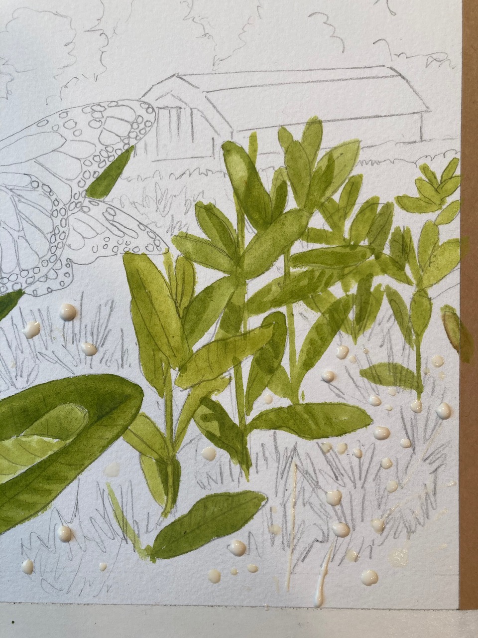
The understory is all red clover, so I decide to put some drops of masking fluid down to reserve the paper for their pink blossoms. Once that's dry, I can keep painting all the jumbled greens right over it.


I keep plugging, painting in milkweed leaves. It ain't easy, making sure every leaf goes to a plant, but I'm still having fun. 


Now that I've got all the milkweed in, here comes the understory of clover foliage. It's a darker green than the milkweed. 


This is fun! I'm creating an army of vegetation! 


When I'm satisfied with the meadow, I rub away the drops of dried masking fluid with my fingers and expose the white paper beneath. Then I get to paint lots of red clover. It's important to vary the shade of the blossoms, to give the impression of changing light, distance and depth. 
I decide to go ahead and paint the sky right afterward.  It's very fast and dashy.  Even so, I have a little trouble controlling the wash--the paper is drying too fast, dang it! Ack! I have to finish it all before it dries! I'm slapping paint and water around but in the winter, with low humidity in the house, you don't have much time to tarry. Oh well--that's watercolor skies for you! You can see that I've run the wash down into the tops of the trees behind the barn. That's important to avoid hard edges where the washes meet. 


Here come the trees behind the milkweed. Their darks will help anchor the composition. 


I knew that once I got some darks in there, the painting would come to life. With the sky of blue and the anchoring darks, you can finally feel the sunshine pouring down! I got wound up painting the flowers and buds and forgot to take progress shots. 


There's a hard line between the trees and sky that I don't like, so I soften that by scrubbing the paint off and sucking it up with a damp brush. Then I run a wash of Chinese white over it to dull it out further, and push it well into the background.  Compare the treeline in the photo above to the one below.

Now it's time for the barn! When the black shadow goes in under the roof, that's when the sun really comes out. I'm telling you it's shining by the intensity of that shadow. That's how you suggest strong light--by deep shadow.


You may recognize it as the Shadowbarn! And you may recognize the wee companion, too. 


Sept. 7, 2014

OK. It's butterfly time! 

I haven't painted an ornate butterfly in awhile. Every time, I gain new respect for painters of insects. Whew. So many tiny details, and they all have to be in the right places, or it doesn't look accurate.

Same for the caterpillar, hiding on the lower left. I had to figure out the color sequence before I could paint it. It goes black yellow black white black white black yellow black...Mix that up, and your caterpillar isn't going to look right. 


This post compresses three days of actual painting. Each morning, I'd get up thinking I'd finish it that day, but it turns out I only have so much painting in me in a given day. I'd go out, cut brush for three or four hours, then paint, and before I'd know it, it would be dinnertime. What a good way to spend a few days!

I always feel best when I'm getting lots of exercise and painting, too.  When I'm painting a scene, I get to live inside it as I work. When I paint ivory-billed woodpeckers, I'm seeing them, alive, and I'm living in their habitat. When I paint a monarch fluttering at a milkweed, I'm there in that meadow, kneeling, sweat and all. There's nothing quite like creating a hot summer morning out of nothing, especially when it's dreary outside. It's the closest thing to a time machine that I have.  And that's what I love about painting, after the obvious continuous challenges of striving to attain some kind of mastery over the medium. Nah. Wrong word. Mastery being denied, I'll settle for control!

If you've enjoyed this step by step, just look up in the far left top corner of this blog homepage. Click "Search Julie's Blog" and type "watercolor" in the search box. Free tutorials for years. Been doing them since 2005!

 

Kestrel On Commission

Saturday, December 19, 2020

8 comments

  Today I'd like to give you a little glimpse of what it's like to paint a watercolor to order, for a private commission. I was asked by a longtime follower of my writing and art to paint a kestrel who visits his Indiana backyard. I have never painted a full-sized kestrel, so I was eager to take this on. My path was clearly laid out; Mr. F. wanted the bird perched on his deck railing, looking into the window, as it does when it visits. I was a little doubtful that I could make an interesting painting of someone’s lawn and deck railing, but when I asked for photos, I could see that the beautiful forest border in my client’s Indiana backyard  would allow me to play up a fall feeling and sail through.

I struggled with the composition for awhile, doing a throwaway study of it as a vertical piece. Yes, it's on horrible copy paper that wrinkles badly. This is on purpose. I don't want to spend any more time than I have to slapping it together. It's purely for composition and color thinking purposes.


I realized that the bird needed more space, and the yard needed more features to be recognizable. It took quite awhile for me to come to the idea of making it a larger horizontal composition, but when that finally occurred to me, things came together quickly. (The whole thing took about a week to lay out and paint, so "quickly" is a relative term).  Unfortunately, I did not take progress photos of the painting. The washes were so large and so wet that I just kept plowing away. The original is 12 x 16, which is big as my paintings go.

 I I painted the treeline first, keeping it very loose, laying down an underpainting of New Gamboge yellow to tie it all together. I used the same underpainting on the lawn grass, fully aware that It was not the bright almost kelly green that appears in the photo. Let’s just say that in my painting there have already been a few hard frosts. I abhor painting bright green grass, always shifting it to lime or yellow if I can get away with it. For me, lawn grass green looks nice in nature, but in my watercolors, it's a beauty killer. On the other hand, I always enjoy painting weathered wood, so I knew the railing would be a piece of cake to paint, even though it’s a pretty tough compositional element, unequivocally dividing the composition.


The reference photo was taken from eye level on a tall man. I  thought it would help to drop the point of view, so you’re viewing the bird and railing more at eye level. That would in turn drop the treeline, and reduce the amount of lawn I’d have to deal with. 

 In progress, on my desk. I haven't finished the bird, but it's getting there. 


The dwarf apple trees in the reference photo, which I intended to include so as to make the backyard recognizable, lacked a little in aesthetic impact, one having lost its leaves. I aged them by about 30 years , twisted their trunks, and clothed them in leaves, giving them probably more fall color than they would really have. Call it artistic license, to tart up some apple trees. I masked them with liquid masking compound and didn't remove it until I was all done with the forest and lawn. That turned out to be a good choice because I went over the lawn several times with large brushes and washes, trying to tame the green into something that would look nice with a kestrel's brilliant colors, and painting around those branches would have been a nightmare.


So it goes with my paintings…I make sure everything else is done before I get to start on the bird. But I have to keep backtracking. Once the deck railing went in, it mandated a lot more detail in the forest and the lawn, so there was a lot to do there. I knew that would happen. It's tough to have a super-detailed subject in the foreground and just haze out the background, unless you want it to look like someone’s photo. 


I knew that the sky could make or break the painting. I didn’t want a super bright blue, and I wanted lots of clouds, to give it light and air. I wanted a feeling that the weather could change at any moment, the way it does in October. And like magic, when the clouds went in, the whole thing lightened up and you could see sunshine. I absolutely love painting clouds. I sketch them in pencil very loosely on the paper. Then, the trick is to get the paper as wet as you can. Then paint in the gray underbellies of the clouds, darker than you want them, because watercolor fades as it dries. Then, while everything is still sopping wet, get your brush loaded with blue and with the tip just tickle in the areas of blue sky, letting the blue spread and bleed into the white you’ve left around the cloud shadows. Voila. Try to avoid hard edges, but when you’re painting a big sky area,  they happen while you’re busy somewhere else. That’s what makes it watercolor. Such a blast to paint cumulus clouds. You just have to wet that paper and let them happen. This medium was made for skies and clouds. 


My best reference for skies turns out to be the photos I take many times yearly of the Three Graces. I found just the sky I wanted in this mid-October photo.


My client had a firm idea of what he wanted in the bird. He’d found a photo of a kestrel online with just the pose and attitude he wanted. While I liked the angle, and the bird was adorable, I wasn’t crazy about its overall condition. It looked rough to me, like it wasn’t getting the right diet. The jesses and the military uniform suggest it’s a mascot, not perhaps in the care of an active falconer who lets it hunt for fresh live food. So I went about improving its disheveled plumage texture and color and improving its soft part coloration, and redrew its wings and tail to make them more understandable to the viewer. (in this photo, the bird's tail is depressed straight down for balance, and the wingtips are a bit disordered).  Mostly, I wanted my bird to look smooth and in perfect feather (wild), which the reference bird is clearly not. Here is a comparison photo to show you what I’m talking about.


Compare this longterm captive kestrel with this clearly wild bird, below. Look at the feather coloration and texture of the wild one. There's an intensity of color of the plumage and soft parts that comes from a wild live diet and lots of exercise. There's a smoothness there, a perfect interlocking of barbules, no roughness. This bird is in perfect condition, as it needs to be to survive in the wild. 


Photo by Kenny Diaz, Adobe Stock (used purely for illustrative purposes here)

The most important thing, after satisfying the client's wishes, was to capture kestrel magic. 
I was after something more resembling the condition of the bird in the second photo, though my efforts are pitiful compared to Nature's. The few times I've been close to a wild kestrel--most recently when I was involved with a rescue last winter--I have been astounded by their beauty and intensity. Of course, being so small, that beauty has an elfin quality, as in:  "I can't believe this bird is so beautiful, so perfect and small and colorful!" Their dark eyes spark and glow; their perfect little feet and ceres match in deep egg-yolk yellow, and the combination of brilliant rust, slate blue, peach, and cream, set off by inky black, in their plumage is amongst the most ornate and pleasing of any bird I know. Anyway, I tried, and I can see a million ways that it falls well short of the real thing, but it'll do, I guess.


All in all, it was a fun painting to do, a challenge to pull off; to walk that line between what the client asks me to do and what I might have chosen to do. This was more proscribed than the usual private commission, because it was important to the client that his backyard be recognizable. More than that, though, he also knew what he wanted for the bird and even supplied the reference photo. That doesn't happen very often. So my job as an artist who has accepted a specific commission was not to paint whatever I wished. My job was to set aside my own ideas about what would constitute an interesting kestrel painting, and work to make the best composition I could with what I was given. It’s a little like those TV chef challenges where you open up a refrigerator with four ingredients in it and are asked to make a dish of them. I feel that I cooked up something tasty. My client is thrilled with it because it’s faithful to his setting and has just the bird he wanted, and I had fun in my experimental watercolor kitchen. Win/win!


I think that, as a career illustrator, I am probably happier painting the occasional commission than many artists might be. I'm quite used to being asked to deliver a specific scene, behavior, event...it's a challenge I willingly accept. In some ways it's easier, more cut and dried, than dreaming up the most boffo "ideal" painting of a given species. That said, it's also great to have free rein, and artists given free rein tend to be happy artists. My choice is to be happy about whatever I'm doing, because painting watercolors in the comfort of my studio beats any number of alternatives I could name. 


I'll leave you with a case of the warm fuzzies: what it was like to be painting one of my favorite birds for a wonderful client, on a snowy December afternoon. 


[Back to Top]