Background Switcher (Hidden)

Showing posts with label painting birds. Show all posts

Kestrel On Commission

Saturday, December 19, 2020

8 comments

  Today I'd like to give you a little glimpse of what it's like to paint a watercolor to order, for a private commission. I was asked by a longtime follower of my writing and art to paint a kestrel who visits his Indiana backyard. I have never painted a full-sized kestrel, so I was eager to take this on. My path was clearly laid out; Mr. F. wanted the bird perched on his deck railing, looking into the window, as it does when it visits. I was a little doubtful that I could make an interesting painting of someone’s lawn and deck railing, but when I asked for photos, I could see that the beautiful forest border in my client’s Indiana backyard  would allow me to play up a fall feeling and sail through.

I struggled with the composition for awhile, doing a throwaway study of it as a vertical piece. Yes, it's on horrible copy paper that wrinkles badly. This is on purpose. I don't want to spend any more time than I have to slapping it together. It's purely for composition and color thinking purposes.


I realized that the bird needed more space, and the yard needed more features to be recognizable. It took quite awhile for me to come to the idea of making it a larger horizontal composition, but when that finally occurred to me, things came together quickly. (The whole thing took about a week to lay out and paint, so "quickly" is a relative term).  Unfortunately, I did not take progress photos of the painting. The washes were so large and so wet that I just kept plowing away. The original is 12 x 16, which is big as my paintings go.

 I I painted the treeline first, keeping it very loose, laying down an underpainting of New Gamboge yellow to tie it all together. I used the same underpainting on the lawn grass, fully aware that It was not the bright almost kelly green that appears in the photo. Let’s just say that in my painting there have already been a few hard frosts. I abhor painting bright green grass, always shifting it to lime or yellow if I can get away with it. For me, lawn grass green looks nice in nature, but in my watercolors, it's a beauty killer. On the other hand, I always enjoy painting weathered wood, so I knew the railing would be a piece of cake to paint, even though it’s a pretty tough compositional element, unequivocally dividing the composition.


The reference photo was taken from eye level on a tall man. I  thought it would help to drop the point of view, so you’re viewing the bird and railing more at eye level. That would in turn drop the treeline, and reduce the amount of lawn I’d have to deal with. 

 In progress, on my desk. I haven't finished the bird, but it's getting there. 


The dwarf apple trees in the reference photo, which I intended to include so as to make the backyard recognizable, lacked a little in aesthetic impact, one having lost its leaves. I aged them by about 30 years , twisted their trunks, and clothed them in leaves, giving them probably more fall color than they would really have. Call it artistic license, to tart up some apple trees. I masked them with liquid masking compound and didn't remove it until I was all done with the forest and lawn. That turned out to be a good choice because I went over the lawn several times with large brushes and washes, trying to tame the green into something that would look nice with a kestrel's brilliant colors, and painting around those branches would have been a nightmare.


So it goes with my paintings…I make sure everything else is done before I get to start on the bird. But I have to keep backtracking. Once the deck railing went in, it mandated a lot more detail in the forest and the lawn, so there was a lot to do there. I knew that would happen. It's tough to have a super-detailed subject in the foreground and just haze out the background, unless you want it to look like someone’s photo. 


I knew that the sky could make or break the painting. I didn’t want a super bright blue, and I wanted lots of clouds, to give it light and air. I wanted a feeling that the weather could change at any moment, the way it does in October. And like magic, when the clouds went in, the whole thing lightened up and you could see sunshine. I absolutely love painting clouds. I sketch them in pencil very loosely on the paper. Then, the trick is to get the paper as wet as you can. Then paint in the gray underbellies of the clouds, darker than you want them, because watercolor fades as it dries. Then, while everything is still sopping wet, get your brush loaded with blue and with the tip just tickle in the areas of blue sky, letting the blue spread and bleed into the white you’ve left around the cloud shadows. Voila. Try to avoid hard edges, but when you’re painting a big sky area,  they happen while you’re busy somewhere else. That’s what makes it watercolor. Such a blast to paint cumulus clouds. You just have to wet that paper and let them happen. This medium was made for skies and clouds. 


My best reference for skies turns out to be the photos I take many times yearly of the Three Graces. I found just the sky I wanted in this mid-October photo.


My client had a firm idea of what he wanted in the bird. He’d found a photo of a kestrel online with just the pose and attitude he wanted. While I liked the angle, and the bird was adorable, I wasn’t crazy about its overall condition. It looked rough to me, like it wasn’t getting the right diet. The jesses and the military uniform suggest it’s a mascot, not perhaps in the care of an active falconer who lets it hunt for fresh live food. So I went about improving its disheveled plumage texture and color and improving its soft part coloration, and redrew its wings and tail to make them more understandable to the viewer. (in this photo, the bird's tail is depressed straight down for balance, and the wingtips are a bit disordered).  Mostly, I wanted my bird to look smooth and in perfect feather (wild), which the reference bird is clearly not. Here is a comparison photo to show you what I’m talking about.


Compare this longterm captive kestrel with this clearly wild bird, below. Look at the feather coloration and texture of the wild one. There's an intensity of color of the plumage and soft parts that comes from a wild live diet and lots of exercise. There's a smoothness there, a perfect interlocking of barbules, no roughness. This bird is in perfect condition, as it needs to be to survive in the wild. 


Photo by Kenny Diaz, Adobe Stock (used purely for illustrative purposes here)

The most important thing, after satisfying the client's wishes, was to capture kestrel magic. 
I was after something more resembling the condition of the bird in the second photo, though my efforts are pitiful compared to Nature's. The few times I've been close to a wild kestrel--most recently when I was involved with a rescue last winter--I have been astounded by their beauty and intensity. Of course, being so small, that beauty has an elfin quality, as in:  "I can't believe this bird is so beautiful, so perfect and small and colorful!" Their dark eyes spark and glow; their perfect little feet and ceres match in deep egg-yolk yellow, and the combination of brilliant rust, slate blue, peach, and cream, set off by inky black, in their plumage is amongst the most ornate and pleasing of any bird I know. Anyway, I tried, and I can see a million ways that it falls well short of the real thing, but it'll do, I guess.


All in all, it was a fun painting to do, a challenge to pull off; to walk that line between what the client asks me to do and what I might have chosen to do. This was more proscribed than the usual private commission, because it was important to the client that his backyard be recognizable. More than that, though, he also knew what he wanted for the bird and even supplied the reference photo. That doesn't happen very often. So my job as an artist who has accepted a specific commission was not to paint whatever I wished. My job was to set aside my own ideas about what would constitute an interesting kestrel painting, and work to make the best composition I could with what I was given. It’s a little like those TV chef challenges where you open up a refrigerator with four ingredients in it and are asked to make a dish of them. I feel that I cooked up something tasty. My client is thrilled with it because it’s faithful to his setting and has just the bird he wanted, and I had fun in my experimental watercolor kitchen. Win/win!


I think that, as a career illustrator, I am probably happier painting the occasional commission than many artists might be. I'm quite used to being asked to deliver a specific scene, behavior, event...it's a challenge I willingly accept. In some ways it's easier, more cut and dried, than dreaming up the most boffo "ideal" painting of a given species. That said, it's also great to have free rein, and artists given free rein tend to be happy artists. My choice is to be happy about whatever I'm doing, because painting watercolors in the comfort of my studio beats any number of alternatives I could name. 


I'll leave you with a case of the warm fuzzies: what it was like to be painting one of my favorite birds for a wonderful client, on a snowy December afternoon. 



How to Paint a Bunting

Thursday, September 3, 2020

12 comments

 I'm telling about the execution of my most recent Klamm Award commission for the Wilson Ornithological Society. Each year, the Society commissions me to paint something (a bird and associated stuff) for the winner. The recipient in 2020 is John Kricher, multitalented author of  the recently updated A Neotropical Companion, a classic in the natural history field, and now author of the just-published, lavishly illustrated Peterson Guide to Bird Behavior. 

John's wife, Martha Vaughan, was in on the secret award, and she selected a bird that's one of his favorites--a painted bunting! John and Martha are avid bird art enthusiasts, and they already own a few of my pieces, so I was thrilled beyond thrilled to paint something to surprise John.


I emailed Martha to ask if there was any particular setting she'd like me to use. Yes! She and John had lived in Sunbury, GA, south of Savannah, for parts of ten years and had fond memories of both the coastal marsh and of getting to know painted buntings. She asked for a " 'Georgia On My Mind' setting: a palmetto and some Spanish moss, a bit of tidal river marsh."

Well all right! But I wanted to get it exactly right, so I went back to Martha, asking if she might be able to lay her hands on any reference photos. 

"Luckily when we sold our condo and left Sunbury, GA , John gave me a big file of photos that he had taken over the times we spent there.  I uploaded that file and skimmed it for photos that give a sense of what you are looking for.  I have attached six photos that should help you get the ambience of the region and of our marsh, which we both dearly miss.  I included some that actually have painted buntings in them since John really liked them and getting photos of them."

She sent some real beauties. Here is one of John's photos of a painted bunting in palmetto. Now, the first thing I notice about this is the relative scale of bird to plant. Palmettos are big plants, and there's really no way to get an entire, recognizable palmetto in a painting of buntings, if the bird is perched in the palmetto. You can get pieces of palmetto, but that's about it.

And so began many days of thumbnail sketches, trying to figure out how to incorporate 
"a palmetto and some Spanish moss, a bit of tidal river marsh."


I was delighted to get a photo of a bunting next to Spanish moss, and some kind of oak or holly with more proportionately sized leaves. This would be an important shot, going forward. 


But first I had to bash away at palmettos. They are absolutely lovely plants. But they're just huge. 


I was so tempted by this gorgeous shot. But if it were sitting in a palmetto, the bunting would be approximately the size of the word "alamy" in this photo. How to do this??


I remember the evening when the epiphany hit me that I had to push the palmetto into the middle distance and use the broad-leaved shrub as their perch. That would take care of the morass I was in, of trying to figure out how to scale everything properly. I went to bed happy at last, slept on it, got up the next morning and drew the final composition.

I thought the Georgia marsh so very beautiful, and the few times I'd seen painted buntings, they were near great expanses of marsh and water. So I decided to make the marsh the co-star of the painting. 

As I wrote to John and Martha:

Putting it all together turned out to be the work of weeks, all internal, all thinking and stewing and throwing sketch after sketch into the circular file. The thing that was throwing me was scale. Palmettos are huge plants, and I loved the graphic possibilities of brilliant little birds against their massive fronds. If I drew that, though, I couldn’t figure out how to give “a bit of salt marsh” through them, and also include Spanish moss. I took those three elements: palmetto, Spanish moss, and marsh, and mashed them together in every way I could come up with. Thanks to the tiny-bird-large-frond issue, the palmetto always overpowered the composition and the birds, too. I realized that what I (and probably you) loved the most was the “bit of salt marsh,” that feeling of place, exactly where the birds make their living. So I backed up and started over. Composed the marsh landscape. Then figured out how to work in palmetto in the middle distance, and put the Spanish moss in the front with the birds, because it was in scale with the birds, at least, and wouldn’t take over the composition. I’m not sure what the shiny-leaved thing is—yaupon? Oak? It made a fine foil for the birds, so in it went.


As I often do, I started on the rattiest, thorniest, hardest part first: the Spanish moss. Ugggh! My moss wasn't looking very good. How do I do this??
I masked out the palmettos with masking compound, which makes them look yellowish.


Define, define, define. Take a break and paint a sunset sky. This sky went in in a matter of minutes. Since I knew there would be a big dark oak over most of it, I didn't worry too much about the right side. Just enough to suggest the continuity of colors behind the tree. Fun!


As long as I was on a roll, I decided to paint the marsh. Now you see where the masking compound comes in. 


To spotlight the palmettos, I worked in some darks behind them--coastal scrub.


Bringing the marsh greens and the dark coastal shrubbery up behind the Spanish moss sure helped tie the painting together. 
As a painter you just have to have faith that you're going to be able to pull your fat out of the fire.  Speaking of which, the palmettos...errgh. Time to peel off the masking compound and get painting on those.


Oh man, the nitty gritty interface of all those leaves and the dark background, cleaning up all the messy bits, figuring out who overlaps whom...


That part wrestled to the ground, the tree began to grow. 


And as it grew, a funny thing happened -- the sunset began to sing.


Running the dark line of trees beyond the marsh helped tie the scene together. And a few judiciously placed dark marsh edges defined the channel, which glows with the same colors as the sunset. Ahh.


Let's put a bird on it. No other bird in the U.S.  has the precise shade of sea-green as the female painted bunting. 


And needless to say there is no more colorful bird in the States than the male painted bunting. 


It is unreal in any setting. What a miracle it is! It would all be too much without the royal blue head!


More Spanish moss, please, and longer...


Now the humid breeze is blowing, and I am slapping greenheads.


The birds and the glowing channel, and the little catwalk we'd use to get out to the boat, if we had one.


I worked late into the night, cleaning up palmettos and Spanish moss...


I think it's done. As usual, painting the birds was the very least of it. From my letter to John and Martha:

 For me, it’s all about the setting, about the experience of seeing the bird. I could cop out and do a vignette with a washy background and some sprig of plant, but what would that say about painted buntings? What would that say to you? I wanted to take you back to the marsh view you loved and miss so much. I wanted you to feel the humid sea breeze, smell the marsh, and see the sunset again; to enjoy the lurid colors of painted buntings, colors found on no other birds in North America, and do all that without having to slap a single greenhead. I hope you get to go back in real life, but also hope that this painting takes you there each time you look at it. 

As framed by the Wilson Ornithological Society for presentation to John Kricher: 

 
With all that dark matting it looks to me like a window, looking out on a fabulous fantasy scene! 

Days Three and Four

Wednesday, January 30, 2008

16 comments
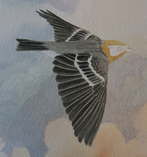
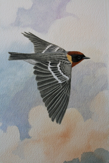
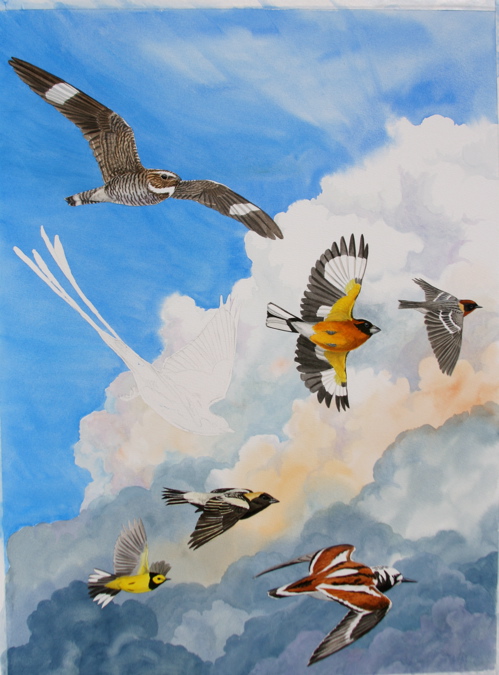
I've started a male bay-breasted warbler, boreal forest breeder and champion long-distance migrant. These little guys may breed in the Yukon and winter in Venezuela. Imagine flying that long and far every spring and fall with only your own two wings to power you. And much of that flight is over open ocean! Egad. We make a big deal about driving for a day or two, and we're just sitting there, burning fossil fuel. These tiny guys are doing it on fat and muscle, and a bay-breasted warbler weighs less than a first-class letter. If you stop and think about it, birds can make you feel like a total slug.

Here's a nice closeup of the paper, to show the quiet but present tooth that it has. I work on Winsor & Newton cold press 140 lb. watercolor paper. Sometimes I stray to other papers but I always come home to it. I've long since shaken my addiction to W&N's overpriced watercolor paints and brushes in favor of Daniel Smith's wonderful paint and synthetic blend brushes. But Winsor & Newton's paper is consistently great and worth the price.

I love working in grays. They're fun to mix and go on smooth as butter. He's a snap to paint, and the best part is tricking in the little black streaks and spots. I chose the bay-breasted warbler as an ambassador from the threatened boreal forests.
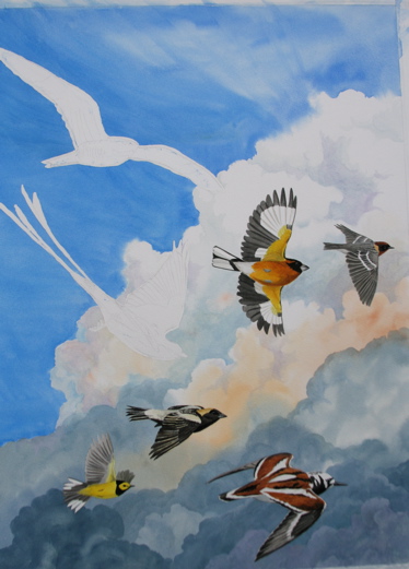
The ruddy turnstone was my emblem of a bird with a vulnerable spot in its migratory route--the horseshoe crab beaches of New Jersey and Delaware.
The bobolink stood for vanishing native grasslands, and the hooded warbler for habitat fragmentation and cowbird nest parasitism. (You can see all that in the painting, right?) No? Hmm. You must not be looking at the clouds hard enough.

Once again, the peach is strategically located to pick up this warbler's fabulous designer color scheme.

Whoops, where did that black-headed grosbeak come from? What can I say? It was a day of fast painting. I wanted at least one exclusively Western bird in the painting, so it couldn't be said to have an Eastern bias. I also like their flash. Considered a rose-breasted grosbeak, but decided on a black-headed because it would speak to Western birders. Ooh, it's starting to look like a painting now.

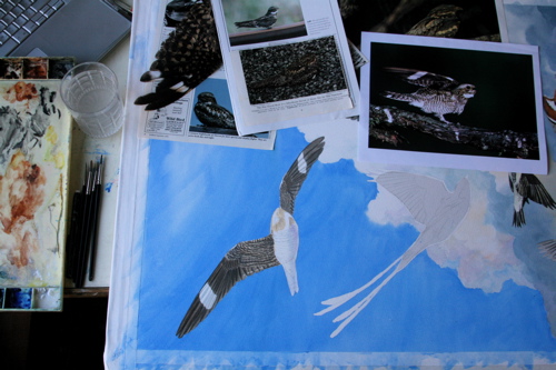
Little Charles is dying to peel the masking film off the nighthawk now. Those mischievous eyes! What if I just...peeled this off...just starting at the corner...dum de dum dum dum, la la la...

Soon enough, dearest tatty bird. But you don't get to do it. You might get carried away.

Part of the reason I started working at the bottom of the sheet is that it gets harder and harder to reach my work as I paint up. I know, I should use an easel so I can stand in front of it. But old habits die hard. I like to work flat, and wreck my back as I crouch over my work, sometimes on my elbows and knees. Maybe I'll try an easel for the next big painting. I can hear Debby Kaspari, who built an easel on her dining room wall for crying out loud, groaning. Zick! Just do it!

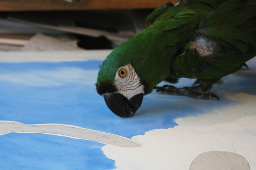
Instead, I turn the thing sideways and twist my body around so I can see what I'm doing. I have reference photos torn from magazines all over the painting, and my laptop, with reference photos cued up, is on the drawing table along with the palette and HUGE painting and patter-footed macaw. Note that I have my painting water (normally in a big plastic jar) in a small, heavy tumbler to reduce the chance that I'll tip it on the painting or laptop.
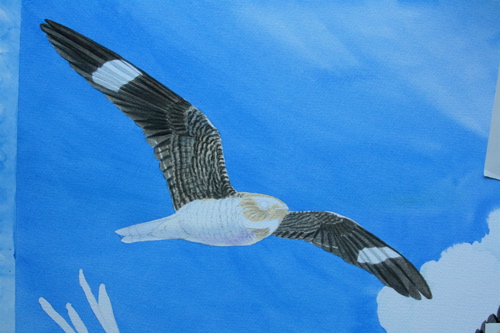
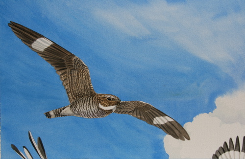
The nighthawk's wings. When painting a bird with lots of bars and stripes, I try to make them a bit messy so the bird doesn't look fake. Too messy, and you lose the sense of the pattern. Too neat, and the bird looks like a carving or paint-by-number model.
And he's done. A bit of an all-day sucker, that one, between the contortions and the size of the image, and all those little stars and bars. I chose a nighthawk because they are just about my favorite fall migrants. I always drop everything and stare at them until they're dots on the horizon. They're so vulnerable, too, because the gravel-topped flat roofs they prefer to nest on are being replaced by cheaper asphalt, which isn't a suitable nesting substrate at all. And it appears they are quite susceptible to West Nile virus, how awful. It seems that everything beautiful is in peril in some way.

But I'm still having loads of fun painting, even as I mull over why each bird has earned its place in my flock, and looking forward to my dessert. Hint: It'll be strawberry gelato. Definitely saving the best for last.
So glad you're enjoying this. It's really fun for me, too. Sometimes I sit back and think about how much more fun life is with a camera. I still can't think of myself as a photographer, but I take a whole lot of pictures, and my camera makes it possible to share moments in time with you. Anybody see the lady in the clouds?
Happy birthday, R, wherever you may be.
[Back to Top]