Background Switcher (Hidden)

Showing posts with label watercolor. Show all posts

Painting the Prairie

Sunday, January 9, 2022

9 comments

 I always figured I'd be a career illustrator. And I was, for a long time. I did my first illustration for pay as a freshman in college, and slowly built a clientele from 1976 onward. By around 1988, I was chugging along doing commissioned watercolors at (gulp) $50 to $75 apiece. I wonder where some of those are now. Lots of book and magazine illustration; some packaging art; even got some drawings into The New Yorker.  I enjoyed it all. 

Around 2004, I decided that it was time to write and illustrate my own books. If I kept taking illustration jobs, I'd never be able to create a book of my own. Bill helped me with that, so much. "Just do a compilation of stuff you've already written! Your columns would make a great book!" Well, I had years of columns from the Backyard Bird Newsletter, which was sent out to a smattering of Bird Watcher's Digest's subscribers in the off months when the magazine wasn't coming out (it was a bimonthly, six issues a year). And they were pretty good--I was writing with a lot of heart and fire at that point. So they'd been published, but not to a wide audience, and they needed to be put together in a book. Bill was so right: it was a good, accessible, nonthreatening way to put my first book together. And I had the best little partner helping me along then. That boy could sell books.

Chet Baker, May 2006, age 3, with Mether's First Book.

Letters from Eden came out in 2006, with a truly ridiculous number of paintings and sketches inside. I really loved illustrating my own writing, and decided to do that from then on. There followed The Bluebird Effect in 2012, and Baby Birds in 2016. Saving Jemima came in 2019. After saying yes to almost every job that had come down the pike since 1976, it felt weird to turn down jobs, but I had to if I was going to finish my books. It was while I was writing The Bluebird Effect that I also realized that daily blogging was a huge block to my productivity, so I cooled it a bit on the frequency of my posts. Every day? Really? What was I thinking??

As I think about it, painting commissioned watercolors is in many ways a return to my old illustration days, when I enjoyed the challenge of creating a work of art with specific elements requested by the client. Some are very loose (perhaps just giving me the species of bird and leaving the setting up to my discretion), but most are pretty exacting and specific. People want a bird in a specific place, and sometimes it goes farther than that. The painting I'll show you now is one of the most exacting I've done, but I loved every minute of creating it. It presented more than an ordinary challenge.

This client is an ornithologist who has studied phoebes for much of his career. He wanted a painting of a Say's phoebe in the Smoky Hills of Kansas. This is a region known for distinctive chalk bluffs which rise up out of the ancient prairie like buildings. It's also known for its limestone fenceposts (lacking trees, I suppose, they made them out of the material at hand). My client wanted those in the painting. And native sunflowers, and yucca (!). He wanted the phoebe to be large in the frame. That would be the biggest challenge of all--to convincingly place a very small bird in a limitless landscape. 

  That is, in fact, the challenge that I face over and over as a bird painter. If someone likes a bird enough to request a painting of it in a specific place, they want to see the bird in detail. But how do I convey the vastness of the Kansas prairie, while placing a 7" bird in it right up close? Much to think about.

I don't have photos of my compositional phase, which is a lot of scribbles in soft pencil on large paper.
I shot some drafts to the client and got approval and tweaks, too. One of the things that became abundantly clear was that I couldn't use a limestone fencepost as a perch, because the post was too huge in relation to the bird. To be true, the post would have to be maybe twice the size it is in this draft composition, which was unacceptable to my eye. So I decided to put the bird on Maximilian sunflowers, which are in much better scale to its size.

The post is probably 1/4 the size it needs to be here in relation to the bird, and even that is getting a bit too big for the composition. Let's go to Plan B, push the posts into the middle distance, and put flowers up front instead.


Then I painted the most important thing: a half-sized study of the painting which would be my guide for executing the real thing. I just Xeroxed my sketch onto some watercolor paper, stretched the paper and painted it as quickly and messily as I could. In the process, I figured out what to do and what not to do; what to paint first and how to handle a very complex and (to be honest) rather vexing foregound.


I traced the composition onto a large sheet of watercolor paper (Winsor & Newton), then stretched the wet paper on a board using packing tape on the edges.


When it dried, I applied masking film and masking fluid around its edges to the parts I wanted to paint last. Then I could paint the landscape freely over those masked parts, knowing I could peel the mask off and have nice white paper to work on when the landscape was done. You can see here that the sunflowers and bird are masked off as a chunk. Same for the chalk bluff in the middle distance, and the white limestone fenceposts staggered across the prairie.


I learn a lot by looking at my colleagues' work, and I decided to try a technique the Barry Van Dusen explains in his magnificent book, Finding Sanctuary, which was published by the Massachusetts Audubon Society and Puritan Press.
If you're curious, here's my post about Barry's work, and a guest post from Barry himself.

If you click that link you probably won't come back to see my stuff! But I hope you do.

Anyway, Barry mixes a neutral tint (I think it's ultramarine, burnt sienna and ultramarine violet) and paints the shadows in his paintings before adding any color. This is completely different from the way I usually work, but I wanted to try it here. I'm self-taught, and never learned the proper way to paint.


Here I go, tickling in those shadows.


So far, so good. I marched the shadows up to the middle ground. I was so excited to see how it would look with the prairie greens over the tinted shadows!


Well, that's cool! Here's a little close-up of the far-out ridges. I love those shadow colors of distant hills.


Something about having the shadows already in made it less scary to handle these wide-open spaces.


My work always gets harder, the closer to the foreground I get. 


Grasses are my nemesis. Making them look realistic without getting too regular and fussy always stretches me to the limit. I look at Cindy House's pastel paintings and just cannot believe how well she handles grass. She ENJOYS painting grass. There's So Much Grass here. I knew, because its leaves were so delicate and thin, that I would be unable to mask out the yucca plant in the right foregound, so I painstakingly painted it in opaque gouache over the grassy foreground.


Only when I had the foreground grasses under control would I allow myself to start on the Maximilian sunflowers and chalk bluff. I peeled off the masking film and rubbed the dried masking fluid away with my fingers and a soft white eraser.


Because it was September, I could go out and cut Maximilian sunflowers on my very own prairie patch and paint it from life! That was awesome.

Oh look! A song sparrow. I think I know him...


The sunflowers brought a needed touch of green to a rather sere landscape. I did not want to do a big green painting. Greens can get away from you. So I kept them very dialed back.


Here come the sunflowers!  I still have the limestone fenceposts masked out here. 


I got absorbed in the fenceposts and painted the chalk bluff, too, before I remembered to take another shot.
One of the ways you say, "It's sunny" is to paint deep sharp shadows on things like bluffs and fenceposts. I could feel the light pouring through, and the sky wasn't even in yet. 


I couldn't wait to paint the sky! All the shadows were in--now I need a sky that will convince you it's sunny out!


But first the Say's phoebe--such a subtly beautiful bird it is. I painted a fresh immature with cinnamon wingbars and a strong cinnamon wash below.


All in but its black tail!


It's sky time, y'all. No progress photos on the sky--that happens too fast to take pictures, and all wet on wet! I am particularly pleased with the perspective of the clouds going off in the distance, and the sunny space they create in the landscape beneath. They're blurry, which for me evokes the prairie wind, which never stops. The sunflowers are tossing in that wind.


I didn't want to pack this one up to send. Sometimes I wish I could keep my paintings. But off it went, to Kansas, where it truly belongs.


Say's Phoebe in the Smoky Hills, Kansas.  Private Commission, October 2021 Watercolor, 14" x 18"


Making a Summer Day

Wednesday, February 3, 2021

10 comments

Lest anyone think that the only thing I've done during the past two years is rip out invasive vegetation, I'm happy to say that 2020 has been a super-painty year for me. I took an 18-painting commission and knocked it out from August-December. I should have been working on it all year, but I couldn't focus in the first five months of the pandemic. My kids were home and I felt this frantic need to hold them close and do stuff with them and serve Sunday best meals every dang night. I'm so glad we did that--took the hikes and the bike rides and shared the incredible meals. We picked flowers and vegetables from the garden. We raked mountains of lawn clippings. We raised a song sparrow named Dustin and took long walks and played with Curtis. 

And then August came and they had to go back to their lives, and with the house quiet and nobody "needing fed," as we say in Appalachian Ohio, I could finally get going on those paintings. 
Wish I could show them to you, but like all my works for publication, I can't, at least until they're produced. Oh, I had such fun! and I can't wait to show you the paintings. I was working so hard and fast I didn't take progress photos, but it'll be fun to show them to you when I am finally allowed.

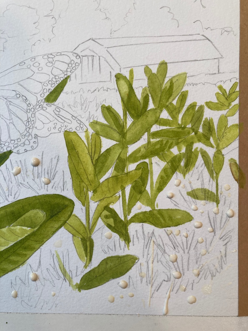
Still feeling fairly well-oiled from that experience, I was delighted to start a 9.5 x 12" watercolor. I'm happy to be able to share the process of creating a paeon to the monarch butterfly, and to my favorite stand of milkweed on the planet, property of my good neighbors on the ridge. For those who don't know the story, this is a field, thick with common milkweed, that, when I discovered the problem, was being mowed down at the absolute height of caterpillar abundance. All I had to do was work with the landowner to adjust the mowing schedule to mow right after the flowers faded, and then not at all until after frost, and BOOM we had a going proposition, absolutely cranking out monarchs. Soo satisfying, and the rewards flutter over by the dozen in August and September. I've been loving and studying this field since about 2009. It's the biggest contiguous stand of common milkweed I've ever seen.

So I've cobbled together a composition with a milkweed plant as the star. I've drawn it all out, transferred it to the watercolor paper, and taped the paper down sopping wet. As it dries it stretches taut, so it doesn't buckle when I lay a big wash on it.  I tackle the big milkweed plant first. 


It's important to notice the big difference in local color of the leaf tops and their undersides. Thoe pale undersides, and the little veins on them, give a sense of movement, transition, and sinuousness to the plant. They are the grace notes that lead the eye around the form.  I paint some shadows in on the leaves, and then start on the field proper. Painting masses of plants is always a little tricky, but I'm trying not to get too wrapped up in it. I figure I'll do a few milkweed plants that you can identify as such, and then get less specific with the understory.


The understory is all red clover, so I decide to put some drops of masking fluid down to reserve the paper for their pink blossoms. Once that's dry, I can keep painting all the jumbled greens right over it.


I keep plugging, painting in milkweed leaves. It ain't easy, making sure every leaf goes to a plant, but I'm still having fun. 


Now that I've got all the milkweed in, here comes the understory of clover foliage. It's a darker green than the milkweed. 


This is fun! I'm creating an army of vegetation! 


When I'm satisfied with the meadow, I rub away the drops of dried masking fluid with my fingers and expose the white paper beneath. Then I get to paint lots of red clover. It's important to vary the shade of the blossoms, to give the impression of changing light, distance and depth. 
I decide to go ahead and paint the sky right afterward.  It's very fast and dashy.  Even so, I have a little trouble controlling the wash--the paper is drying too fast, dang it! Ack! I have to finish it all before it dries! I'm slapping paint and water around but in the winter, with low humidity in the house, you don't have much time to tarry. Oh well--that's watercolor skies for you! You can see that I've run the wash down into the tops of the trees behind the barn. That's important to avoid hard edges where the washes meet. 


Here come the trees behind the milkweed. Their darks will help anchor the composition. 


I knew that once I got some darks in there, the painting would come to life. With the sky of blue and the anchoring darks, you can finally feel the sunshine pouring down! I got wound up painting the flowers and buds and forgot to take progress shots. 


There's a hard line between the trees and sky that I don't like, so I soften that by scrubbing the paint off and sucking it up with a damp brush. Then I run a wash of Chinese white over it to dull it out further, and push it well into the background.  Compare the treeline in the photo above to the one below.

Now it's time for the barn! When the black shadow goes in under the roof, that's when the sun really comes out. I'm telling you it's shining by the intensity of that shadow. That's how you suggest strong light--by deep shadow.


You may recognize it as the Shadowbarn! And you may recognize the wee companion, too. 


Sept. 7, 2014

OK. It's butterfly time! 

I haven't painted an ornate butterfly in awhile. Every time, I gain new respect for painters of insects. Whew. So many tiny details, and they all have to be in the right places, or it doesn't look accurate.

Same for the caterpillar, hiding on the lower left. I had to figure out the color sequence before I could paint it. It goes black yellow black white black white black yellow black...Mix that up, and your caterpillar isn't going to look right. 


This post compresses three days of actual painting. Each morning, I'd get up thinking I'd finish it that day, but it turns out I only have so much painting in me in a given day. I'd go out, cut brush for three or four hours, then paint, and before I'd know it, it would be dinnertime. What a good way to spend a few days!

I always feel best when I'm getting lots of exercise and painting, too.  When I'm painting a scene, I get to live inside it as I work. When I paint ivory-billed woodpeckers, I'm seeing them, alive, and I'm living in their habitat. When I paint a monarch fluttering at a milkweed, I'm there in that meadow, kneeling, sweat and all. There's nothing quite like creating a hot summer morning out of nothing, especially when it's dreary outside. It's the closest thing to a time machine that I have.  And that's what I love about painting, after the obvious continuous challenges of striving to attain some kind of mastery over the medium. Nah. Wrong word. Mastery being denied, I'll settle for control!

If you've enjoyed this step by step, just look up in the far left top corner of this blog homepage. Click "Search Julie's Blog" and type "watercolor" in the search box. Free tutorials for years. Been doing them since 2005!


How to Paint a Bunting

Thursday, September 3, 2020

12 comments

 I'm telling about the execution of my most recent Klamm Award commission for the Wilson Ornithological Society. Each year, the Society commissions me to paint something (a bird and associated stuff) for the winner. The recipient in 2020 is John Kricher, multitalented author of  the recently updated A Neotropical Companion, a classic in the natural history field, and now author of the just-published, lavishly illustrated Peterson Guide to Bird Behavior. 

John's wife, Martha Vaughan, was in on the secret award, and she selected a bird that's one of his favorites--a painted bunting! John and Martha are avid bird art enthusiasts, and they already own a few of my pieces, so I was thrilled beyond thrilled to paint something to surprise John.


I emailed Martha to ask if there was any particular setting she'd like me to use. Yes! She and John had lived in Sunbury, GA, south of Savannah, for parts of ten years and had fond memories of both the coastal marsh and of getting to know painted buntings. She asked for a " 'Georgia On My Mind' setting: a palmetto and some Spanish moss, a bit of tidal river marsh."

Well all right! But I wanted to get it exactly right, so I went back to Martha, asking if she might be able to lay her hands on any reference photos. 

"Luckily when we sold our condo and left Sunbury, GA , John gave me a big file of photos that he had taken over the times we spent there.  I uploaded that file and skimmed it for photos that give a sense of what you are looking for.  I have attached six photos that should help you get the ambience of the region and of our marsh, which we both dearly miss.  I included some that actually have painted buntings in them since John really liked them and getting photos of them."

She sent some real beauties. Here is one of John's photos of a painted bunting in palmetto. Now, the first thing I notice about this is the relative scale of bird to plant. Palmettos are big plants, and there's really no way to get an entire, recognizable palmetto in a painting of buntings, if the bird is perched in the palmetto. You can get pieces of palmetto, but that's about it.

And so began many days of thumbnail sketches, trying to figure out how to incorporate 
"a palmetto and some Spanish moss, a bit of tidal river marsh."


I was delighted to get a photo of a bunting next to Spanish moss, and some kind of oak or holly with more proportionately sized leaves. This would be an important shot, going forward. 


But first I had to bash away at palmettos. They are absolutely lovely plants. But they're just huge. 


I was so tempted by this gorgeous shot. But if it were sitting in a palmetto, the bunting would be approximately the size of the word "alamy" in this photo. How to do this??


I remember the evening when the epiphany hit me that I had to push the palmetto into the middle distance and use the broad-leaved shrub as their perch. That would take care of the morass I was in, of trying to figure out how to scale everything properly. I went to bed happy at last, slept on it, got up the next morning and drew the final composition.

I thought the Georgia marsh so very beautiful, and the few times I'd seen painted buntings, they were near great expanses of marsh and water. So I decided to make the marsh the co-star of the painting. 

As I wrote to John and Martha:

Putting it all together turned out to be the work of weeks, all internal, all thinking and stewing and throwing sketch after sketch into the circular file. The thing that was throwing me was scale. Palmettos are huge plants, and I loved the graphic possibilities of brilliant little birds against their massive fronds. If I drew that, though, I couldn’t figure out how to give “a bit of salt marsh” through them, and also include Spanish moss. I took those three elements: palmetto, Spanish moss, and marsh, and mashed them together in every way I could come up with. Thanks to the tiny-bird-large-frond issue, the palmetto always overpowered the composition and the birds, too. I realized that what I (and probably you) loved the most was the “bit of salt marsh,” that feeling of place, exactly where the birds make their living. So I backed up and started over. Composed the marsh landscape. Then figured out how to work in palmetto in the middle distance, and put the Spanish moss in the front with the birds, because it was in scale with the birds, at least, and wouldn’t take over the composition. I’m not sure what the shiny-leaved thing is—yaupon? Oak? It made a fine foil for the birds, so in it went.


As I often do, I started on the rattiest, thorniest, hardest part first: the Spanish moss. Ugggh! My moss wasn't looking very good. How do I do this??
I masked out the palmettos with masking compound, which makes them look yellowish.


Define, define, define. Take a break and paint a sunset sky. This sky went in in a matter of minutes. Since I knew there would be a big dark oak over most of it, I didn't worry too much about the right side. Just enough to suggest the continuity of colors behind the tree. Fun!


As long as I was on a roll, I decided to paint the marsh. Now you see where the masking compound comes in. 


To spotlight the palmettos, I worked in some darks behind them--coastal scrub.


Bringing the marsh greens and the dark coastal shrubbery up behind the Spanish moss sure helped tie the painting together. 
As a painter you just have to have faith that you're going to be able to pull your fat out of the fire.  Speaking of which, the palmettos...errgh. Time to peel off the masking compound and get painting on those.


Oh man, the nitty gritty interface of all those leaves and the dark background, cleaning up all the messy bits, figuring out who overlaps whom...


That part wrestled to the ground, the tree began to grow. 


And as it grew, a funny thing happened -- the sunset began to sing.


Running the dark line of trees beyond the marsh helped tie the scene together. And a few judiciously placed dark marsh edges defined the channel, which glows with the same colors as the sunset. Ahh.


Let's put a bird on it. No other bird in the U.S.  has the precise shade of sea-green as the female painted bunting. 


And needless to say there is no more colorful bird in the States than the male painted bunting. 


It is unreal in any setting. What a miracle it is! It would all be too much without the royal blue head!


More Spanish moss, please, and longer...


Now the humid breeze is blowing, and I am slapping greenheads.


The birds and the glowing channel, and the little catwalk we'd use to get out to the boat, if we had one.


I worked late into the night, cleaning up palmettos and Spanish moss...


I think it's done. As usual, painting the birds was the very least of it. From my letter to John and Martha:

 For me, it’s all about the setting, about the experience of seeing the bird. I could cop out and do a vignette with a washy background and some sprig of plant, but what would that say about painted buntings? What would that say to you? I wanted to take you back to the marsh view you loved and miss so much. I wanted you to feel the humid sea breeze, smell the marsh, and see the sunset again; to enjoy the lurid colors of painted buntings, colors found on no other birds in North America, and do all that without having to slap a single greenhead. I hope you get to go back in real life, but also hope that this painting takes you there each time you look at it. 

As framed by the Wilson Ornithological Society for presentation to John Kricher: 

 
With all that dark matting it looks to me like a window, looking out on a fabulous fantasy scene! 
[Back to Top]